Category Archives: CASE Study

Papertrey’s February 2014 Blog Hop – Card 2

Good morning!  Here’s my second card for Papertrey’s February Blog Hop.   Papertrey’s February blog hop theme is spring colors/images.  I went for bright, not pastels since I am ready for some pretty spring flowers.  I am also submitting this to this week’s CASE Study Challenge #179.  Danielle Flanders has such a pretty card that inspired my angled pennants.  Supplies are listed at the bottom.  Happy blog hopping!

P1060946

Supplies:

  • Cardstock:  white (Georgia Pacific), Yo-Yo Yellow (Stampin Up- retired); Delovely (Cosmo Cricket)
  • Ink: Black (Versafine); Raspberry Fizz (Papertrey; Yo-Yo Yellow (Stampin Up)
  • Stamps:  Floral Fusion #1 (Papertrey)
  • Accessories: Harvest Gold button (Papertrey); Raspberry Fizz button (Papertrey); Pure Sunshine spray (Dylusions, Ranger)
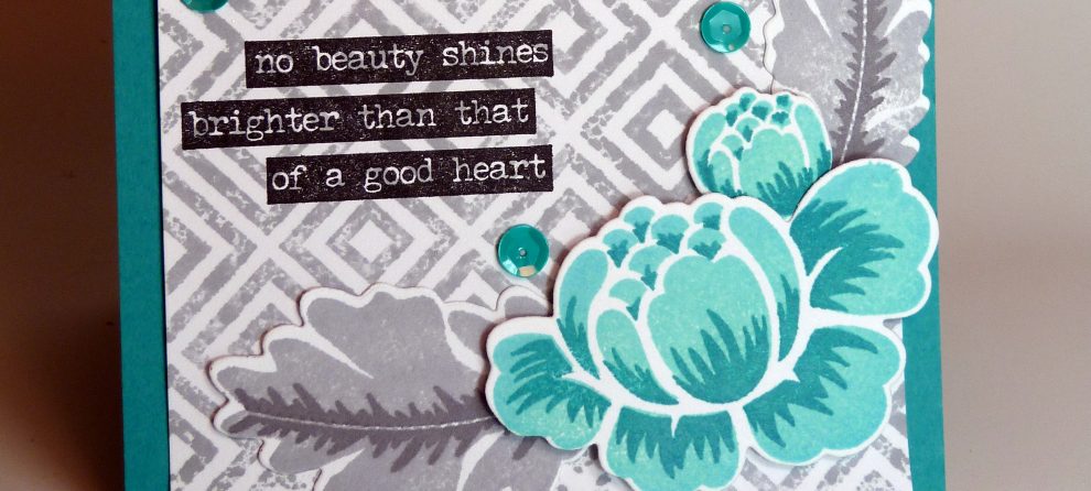
CASE Study Challenge #162

I am participating in the CASE Study Challenge #162.  The inspiration is a card from Elan Roussakis that has a great woodsy background.  It inspired me to make this Halloween card.  I love the glittery spider and have used this sticker on lots of cards.  ETA:  I’m also submitting this to the Handmade Cards Week: The Sticker and Tape Challenge on the Moxie Fab World blog since it includes that fabulous spider sticker!

P1020793

Supplies:

  • Cardstock:  Smokey Shadow (Papertrey); Kraft (Papertrey)
  • Stamps: Happy Day (Papertrey); Web Background (Amuse Studio)
  • Ink: Versamark; Chocolate Chip (Stampin Up); Tea Dye Duo (Papertrey)
  • Accessories: Glitter spider sticker (Jolee’s Boutique); Embossing Powder (Superior); twine

Papertrey Ink 2013 Stamp-A-Faire: Sprinkle of Salt – Take 2

Here’s the 2nd card for the Sprinkle of Salt Stamp-A-Faire challenge.  See the 1st post for more information.  (Edited to Add) I am also adding it to the current CASE Study Challenge).  This is the 2nd half of set that Jennifer McGuire inspired me to complete.  I love being able to use the die cut images in 2 different cards.

P1060039

Papertrey Ink 2013 Stamp-A-Faire: Sprinkle of Salt

I love how this card turned out!  Love the colors and the texture that the salt provides is so fun!  I used twinkling watercolors so there’s lots of shimmer to go with the texture.  I kept the card layout simple so that the watercolor background could shine.  (Edited to add that I have also added this to the current CASE Study Challenge by the very lovely Jennifer McGuire) I love Jennifer’s remake of her original inspiration card.  It is what inspired this and my other card.

P1060041

With so many cards to get loaded tonight I am skipping the usual supply list so if you have any questions, just leave me a comment and I’ll be happy to respond.

CASE Study Challenge #150

I have a card for the most recent CASE study challenge #150.  I love Jocelyn Olson’s card..the colors, the star in the middle with the sentiment!

CSC150_zps42aa7de6

I seem to be into sunburst images lately (you don’t want to know how many sunburst stamps I now own.  So I combined the two and came up with the following card.   I used perfect pearls to soften the strong sunburst image and then impressed the image with my sunshine plate to reinforce the sunburst theme.

P1050507

  • Cardstock: Stamper’s select white (Papertrey Ink), White (Georgia Pacific)
  • Ink: Jet Black archival (Ranger)
  • Stamps: Pinwheel (Midway Collection, October Afternoon), Beautiful Butterflies (Papertrey Ink)
  • Accessories: Pacific Point, Bermuda Bay, Tempting Turquoise, Rich Razzleberry, Melon Mambo, Daffodil Delight markers (Stampin Up), Perfect Pearls and mister (Ranger), , Sunrise Impression Plate (Papertrey Ink)

Father’s Day Card for Case Study Challenge #95

Well it’s Father’s Day today and there’s nothing like leaving a card for the last-minute.  I worked on this one last night and was inspired by Joy Taylor’s Case Study Challenge #95 card.  I love her card layout with a strong vertical element along the left edge and then main focal image the overlays the vertical element.  I saw Joy’s card and knew immediately how I wanted to use it for a stamp set I’ve been wanting to ink up.

And here’s my card….  I used only my new Technique Tuesday stamp set for both the focal image and the border element.  I used my stamp press to keep the sentiments evenly spaced and close to in alignment.  Inside the card says the rest of the sentiment, “that matter most.”  with Happy Father’s Day immediately below it.  A nice simple, masculine card and not a bling, pearl, ribbon in site!  Card details are at the bottom of the post.

Hope you are having a blissful day! Thanks for stopping by….

Supplies:

  • Cardstock: Sky (A Muse Studio)
  • Ink: Onyx Black (Versafine); London Fog (Memento)
  • Stamps: Gone Fishin’ (Technique Tuesday); Happy Day (Papertrey)